Fruits was asked by the Founder of Artia to visually articulate its Mission – ‘Inspire Children to create, so that they grow’ built on the brand purpose or bedrock – Help build success stories of tomorrow.
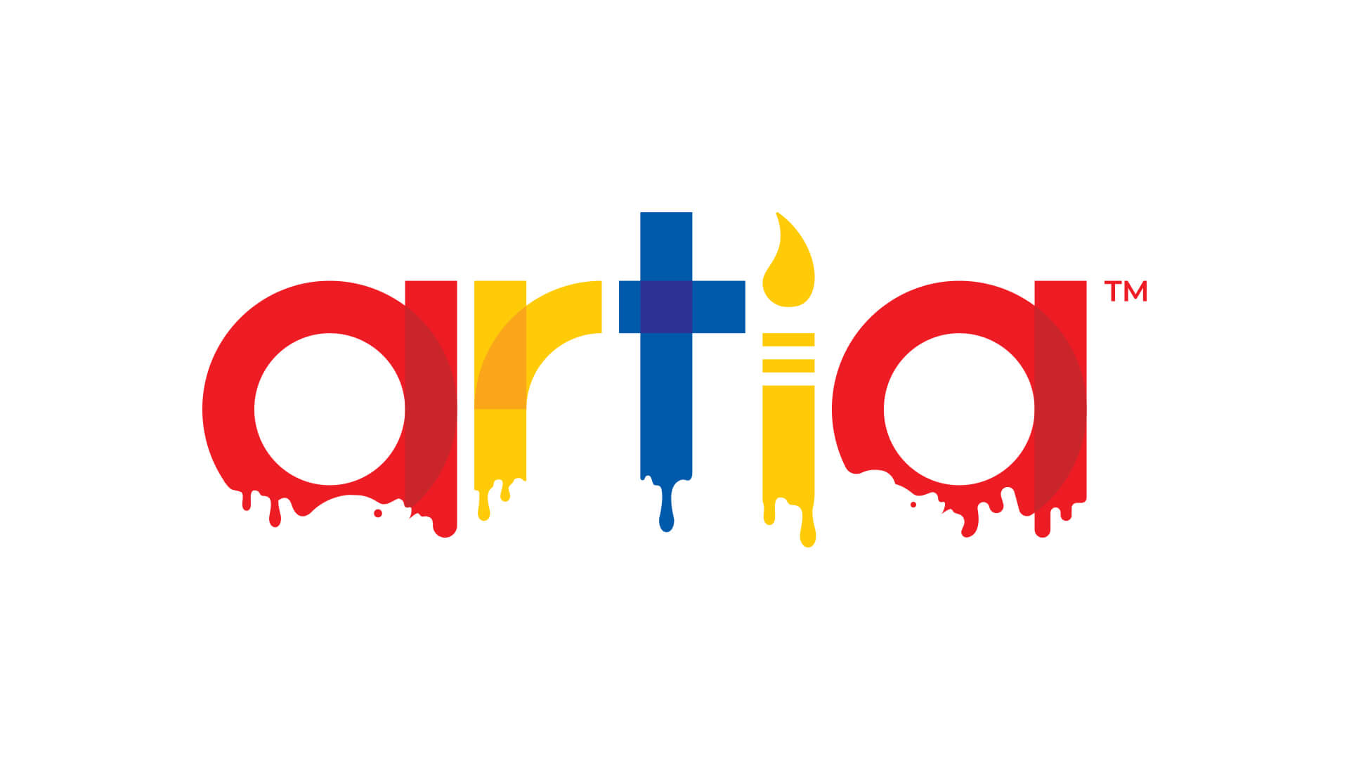
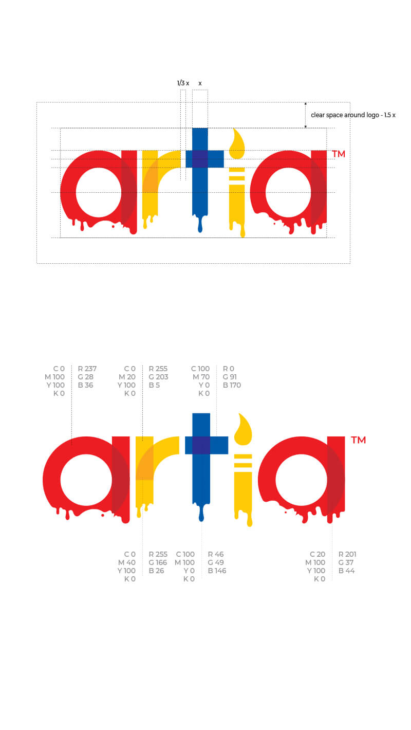
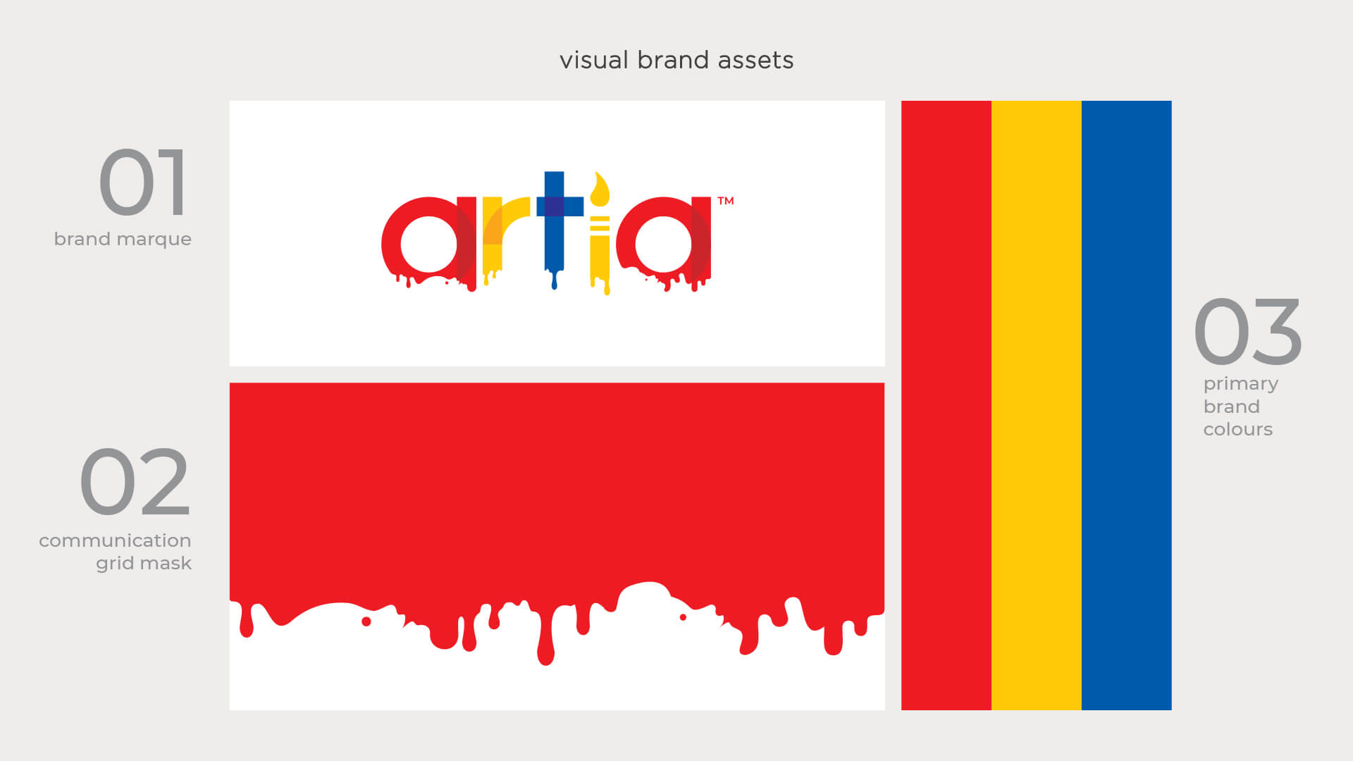
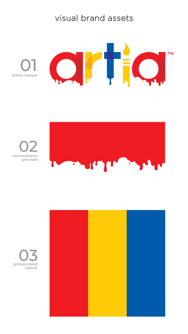
The brand marque design is a contrivance of many layers of art and fun. From various geometric shapes to the Trio – Red-Yellow-Blue (primary colours and the creators of the entire universe of colours) to tools like crayon and a brush, to birth of a new colour where 2 colours are meeting and the most important part – happy learning experience.
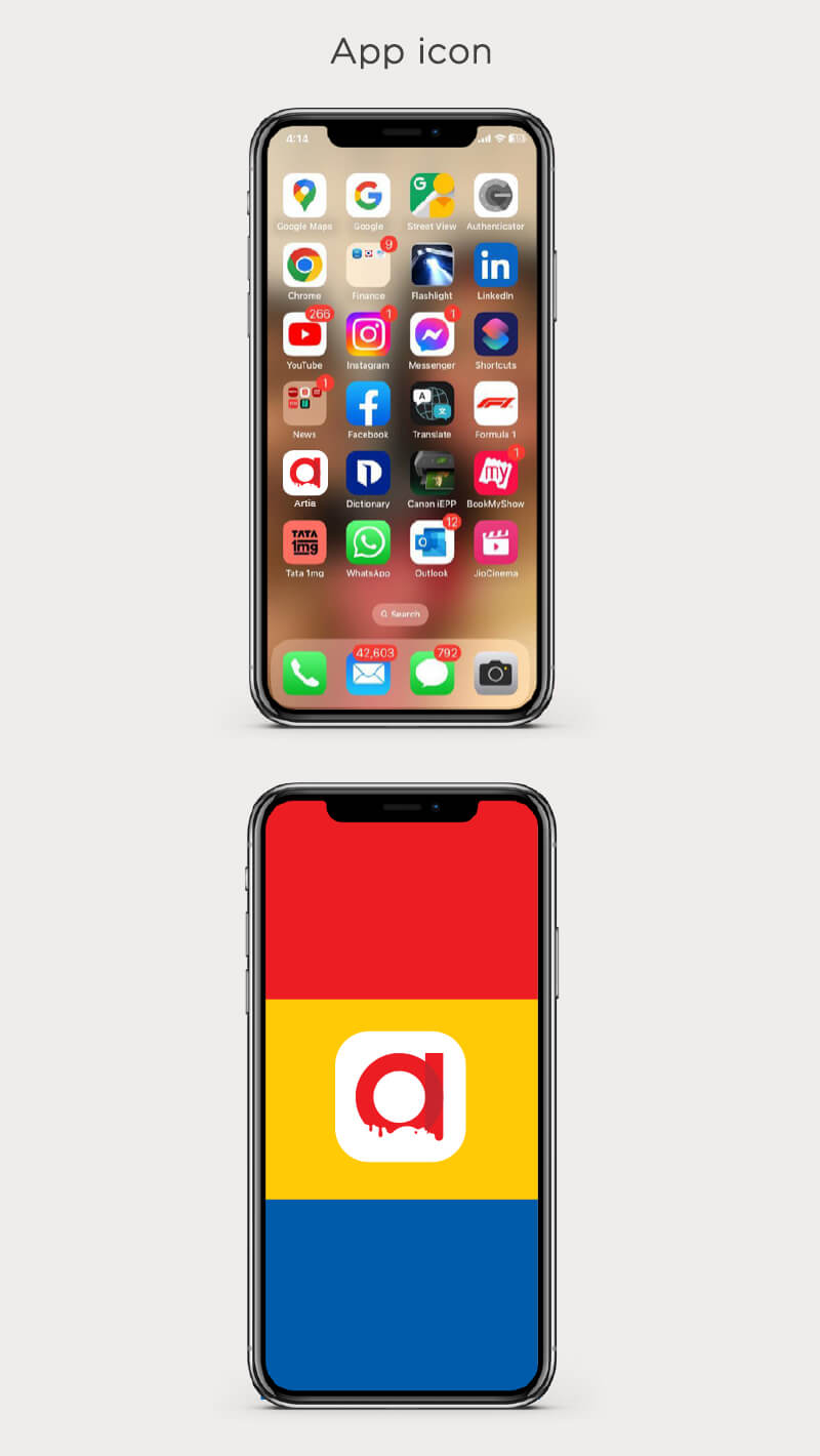
The significance of the unfinished brand typography is an invitation to children to paint and complete the letters. And also, it gives a sense of art-in-motion because of the dripping colours. Many layers to many people…that’s why we started referring the marque as ‘The Onion’!